
Designing for Print: Tips and Tricks for Stunning Visuals
In today’s digital world, where most information is consumed on screens, it can be easy to overlook the importance of print design. However, print materials still play a significant role in marketing and communication strategies. Whether it’s a business card, brochure, flyer, or poster, a well-designed print piece can leave a lasting impression on your audience. To help you create stunning visuals for print, here are some tips and tricks to keep in mind.
1. Understand the Basics
Before diving into the world of print design, it’s essential to understand the basics. Familiarize yourself with terms like bleed, trim, and safe zone. Bleed refers to the area extending beyond the edge of the page, which ensures that the printer cuts the design accurately. Trim refers to the final size of the printed piece, while the safe zone is the area where important content should be placed to avoid getting cut off.
2. Choose the Right Resolution
When designing for print, resolution is crucial to ensure that your visuals appear sharp and clear. Unlike digital screens, print requires a higher resolution to maintain the quality of the image. Aim for a resolution of at least 300 dpi (dots per inch) to guarantee professional-looking prints.
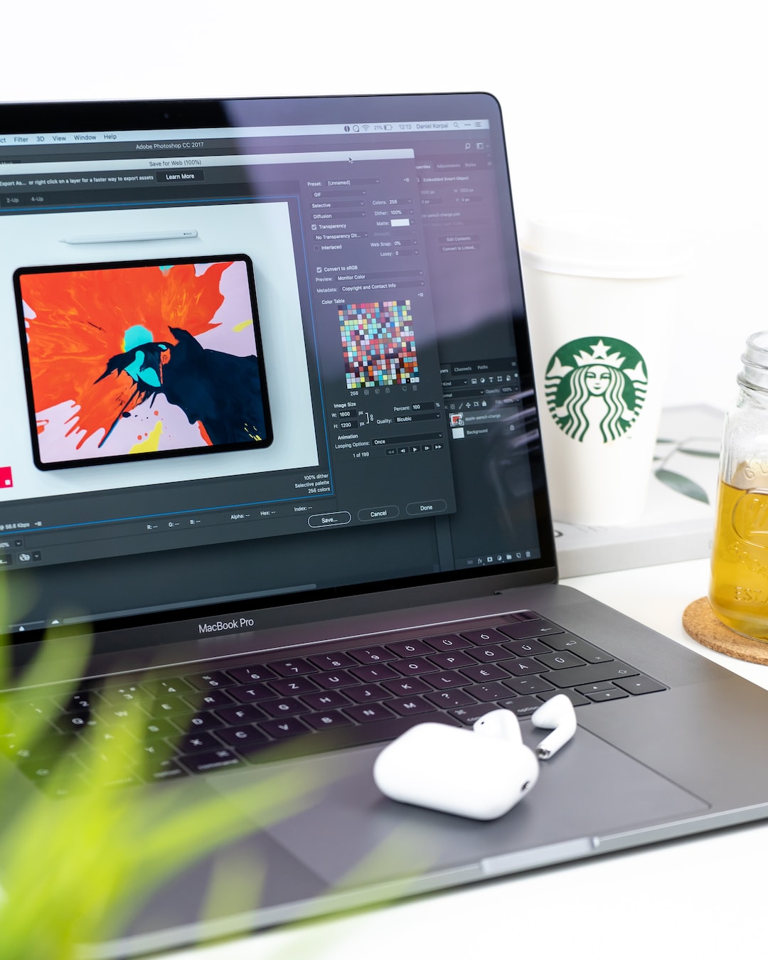
3. Mind the Color Mode
Colors play a significant role in print design, so it’s important to choose the right color mode for your project. Most print materials use the CMYK color mode, which stands for cyan, magenta, yellow, and key (black). This color mode is suitable for printing as it reflects how the printer mixes colors on paper. Stick to this mode to ensure accurate color representation in your print designs.
4. Typography Matters
Typography is an integral part of any design, and print is no exception. When selecting fonts for your print materials, make sure they are easy to read and consistent with your brand image. Avoid using too many different fonts within a single design, as it can create clutter and confusion. Instead, choose two or three complementary typefaces and use them consistently across all your print materials.
5. Pay Attention to Alignment
Alignment is an often-overlooked element of design, but it can make a significant difference in the outcome of your print materials. Aligning elements properly creates a sense of order and cohesion, making your design more visually appealing. Use grids and guidelines to ensure that your text and images are aligned correctly, and pay attention to the overall balance of the design.
6. Use High-Quality Images
Images are a powerful tool in print design, so it’s crucial to use high-quality visuals. Whether you’re using photographs or illustrations, make sure they are clear, high-resolution, and relevant to your message. Avoid using images found on the internet, as they are often low resolution and may result in pixelated prints. Invest in professional stock photos or hire a photographer to capture unique visuals for your print materials.
7. Experiment with Different Finishes
Print isn’t just about the design; it’s also about the tactile experience. Consider experimenting with different finishes to make your print materials stand out. Options like spot varnish, embossing, or foiling can add a touch of elegance and make your designs more memorable. However, use these finishes sparingly and strategically to enhance rather than overpower your visual message.
8. Test Before Printing in Bulk
Before sending your design to the printer for bulk production, always test it on a smaller scale. Print a sample copy to ensure that your colors, images, and fonts appear as intended. This step allows you to catch any errors or make necessary adjustments before spending money on a large print run.
9. Don’t Forget the Margins
Margins are essential in print design, especially if your design includes text or important visual elements. Leaving enough white space around your content ensures that it is easily readable and doesn’t get cut off during trimming. Take into consideration the size of your print material and adjust the margins accordingly to maintain a clean and professional look.
10. Consider Your Audience
Finally, always consider your target audience when designing for print. Understand their preferences, demographics, and expectations to tailor your design accordingly. A well-targeted print piece will not only grab their attention but also leave a lasting impression that drives action.
In conclusion, designing for print requires attention to detail and a deep understanding of the medium. By following these tips and tricks, you can create stunning visuals that captivate your audience and elevate your brand. Remember to experiment, test, and always put your audience’s needs first. With the right approach, your print materials can become powerful tools in your marketing arsenal.